This is a large postarboard gesso piece illustrating an important moment of my life, track. The blue and red lines symbolize the lanes on the track and the foot essentially making a mark on these lanes. I was not totally happy with this piece because I do not like the color choice I chose. It seemed to patriotic and i do not like the color choices of the shoe. If I had to change something it would be making the shoe black and white and a little more bold. I do like the composition of the piece and what it represents. I would give it a 4.C because the work shows good application of 2-D design principles to an acceptable range of design problems.
Friday, November 5, 2010
Thursday, November 4, 2010
Visual Pun
This is my Visual Pun piece and it illustrates Buffal Wings. I ended up very happy with the simplicity and image in this piece and I also enjoyed creating it. I would have liked to made a background pertaining to the Great Plains, where a buffalo might be, but I ran out of time and didn't want to take away from the major element, the wings. In consequence I would grade it 4.B because the work demonstrates some originality, some innovative thinking and purposeful manipulation of the elements and principles of 2-D design.
Architecture Photos
These are the best of my architecture photos. I struggled with this assignment because it was hard for me to find good architecture, but also making it look interesting and incorporating the elements and principles. i am happy with the photos I came up with, especially the blue window, but would have done it differently if given another chance to complete this project. For these reasons I would give myself a 4.I because there may be uneven levels of accomplishment among the works, but overall the work is of good breadth and quality.
Wednesday, October 6, 2010
Anatomical Photomontage
This is my antotomical photomontage and I was very pleased with it. This is one of the few pieces I have created that I am totally happy with. I think it looks perfect and really enjoyed creating it on photshop because I use it all the time and am very comfortable with the program. I wouldn't change a thing about this piece and would give it 6.F because the work is technically excellent; materials and media are used effectively to express ideas.
.
Tuesday, October 5, 2010
Monday, October 4, 2010
Memory Book Pages
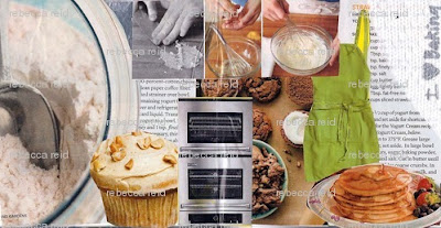
These are the best pages of my memory book and they were also my favorites. The first page I would only change the paper towel on the side into something else to ctreate more flow thoughout the page, but other than that I love it. My cut paper page turned out really well for the first time that I have ever done it, and wouldn't change a thing. My last piece, I also wouldn't change anything and really enjoyed painting it because it combines the to things I like to do, photography and art. I would grade myself 5.B because the work demonstrates a range of original, innovative ideas and effective manipulation of the elements and principles of 2-D design.
Artist Trading Cards
Here, I have posted most of my Artist Trading Cards, but there are a few in particular that really stand out. My pink cubist one I think turned out really well and wouldn't mind using that technique again. I also think that the card with the multiple paint colors with texture is one of my favorites because of the texture, design, and color combination. Lastly the blue sky and balloons card is very well put together and I liked the 3-D element because I used wire to create the balloons. Overall, I think this was my strongest piece, and most creative. Using these three cards as a reference, I would give myself a 5.F because the work is technically strong; materials and media are used well to express ideas.
Subscribe to:
Comments (Atom)


